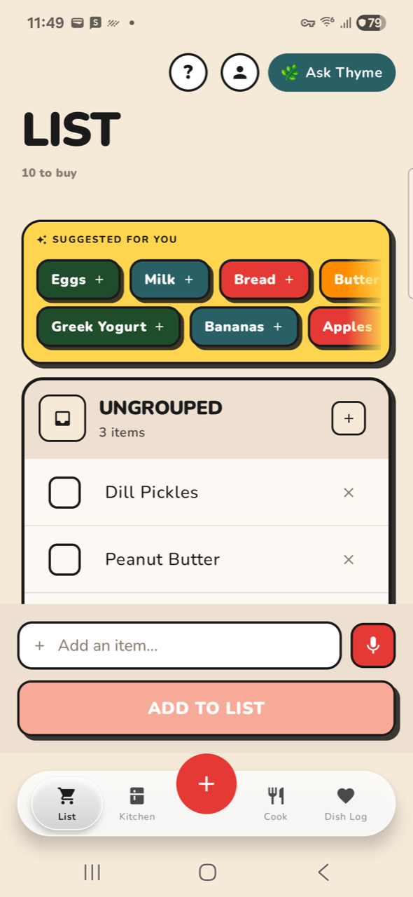
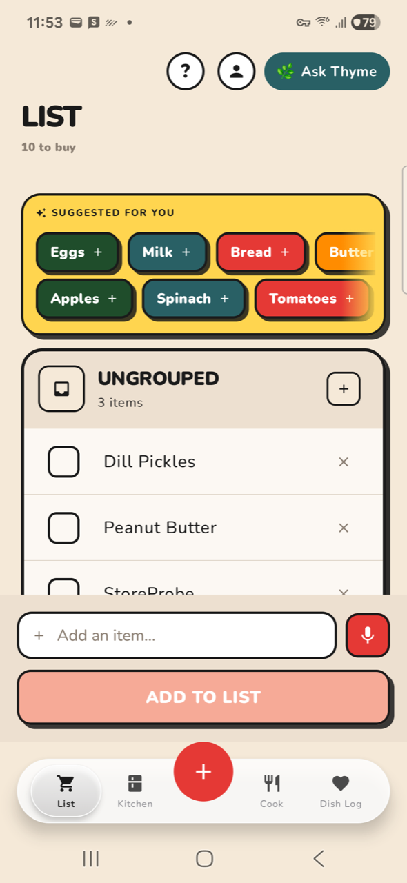
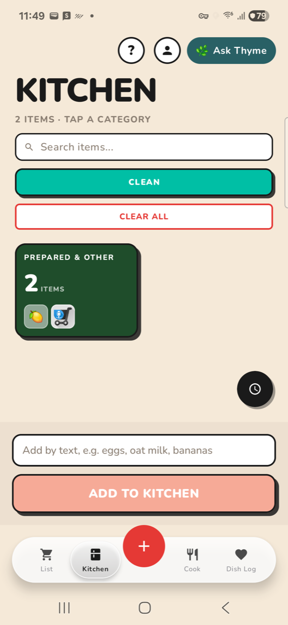
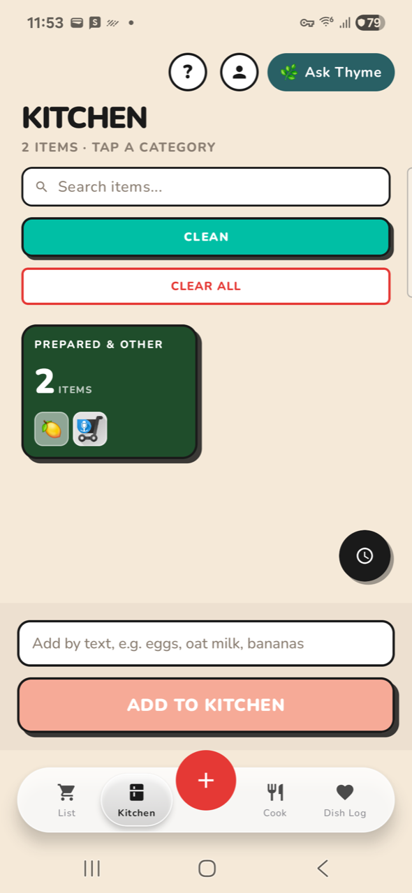
All 56 captured screens measured · build from 2026-09-02 · SM-A366U, 590×1280
The observation holds, and it is measurable. The problem is not
that screens carry too many features — it is that every element is sized as if it
were the only thing on screen. The result is simultaneously too dense (nothing fits) and
too empty (median 21% of each screen is void). Those are the same bug seen from two sides.
Correction, 16:35. The first version of this page listed a finding
“content is clipped mid-word in three places”. That was wrong and has been withdrawn.
I read three ordinary mid-scroll screenshots as clipping defects. Checked on the handset and in
source: the LIST suggestion chips are a deliberate horizontal strip with a 32 dp fade ramp
ported from ContentView.swift:522; the KITCHEN item sheet is a scrolling column with a
24 dp bottom margin; and the LIST scrolls cleanly to its last row with a gap above the
composer. None of the three is a bug. Finding 3 below is its verified replacement, driven on
the device.
21%median dead space
26.8%mean dead space
16screens >45% empty
48pxtab title cap height
2.5×title scale spread
~30%of screen is content
Shipped — before / after
Both changes are committed and running on the handset (48b15583, built and installed on RFCY322W52W). Full unit suite 2,847 green, 13 of them new. Nothing was written to the live shopping list — the planners are pure, so the wiring was exercised in tests rather than against the household.
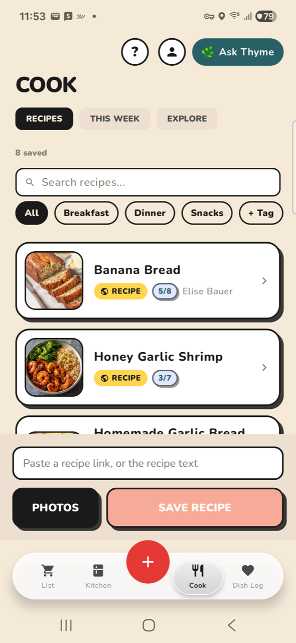
Correction on my own estimate. I said the title change would buy ~90px. Measured on the device by aligning the before/after captures, it buys exactly 33px on all four tabs — 2.9% of the usable screen, not 8%. The 90px came from measuring the title’s ink and assuming the padding around it would collapse too; it does not. The change is still worth having and it puts the code back in agreement with spec/DESIGN_SYSTEM.md, but it is a third of what I promised, and the density problem is not mostly the title.
1 · Screen titles: 44sp → 28sp
LIST
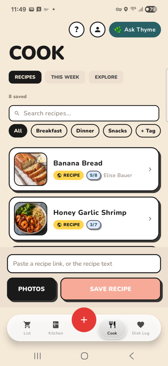
BEFORE · title 44spAFTER · title 28sp · +33px
KITCHEN
BEFORE · title 44spAFTER · title 28sp · +33px
COOK
BEFORE · title 44spAFTER · title 28sp · +33px
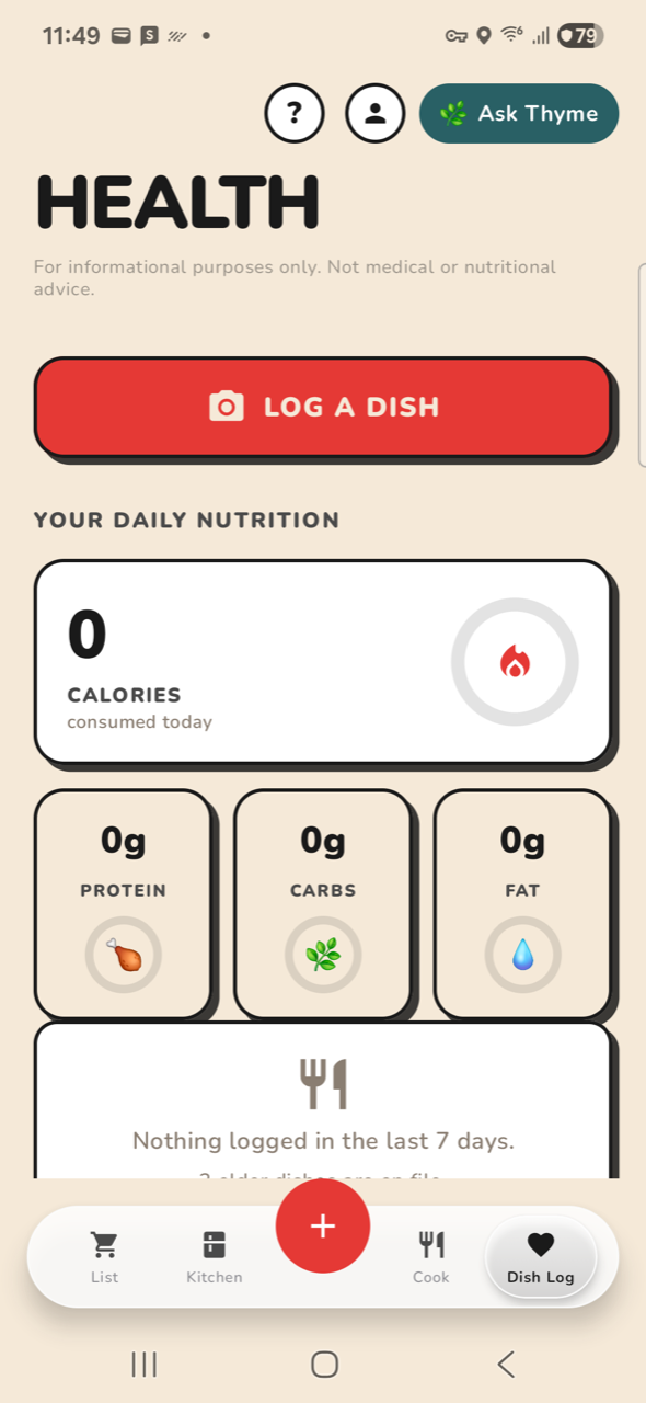
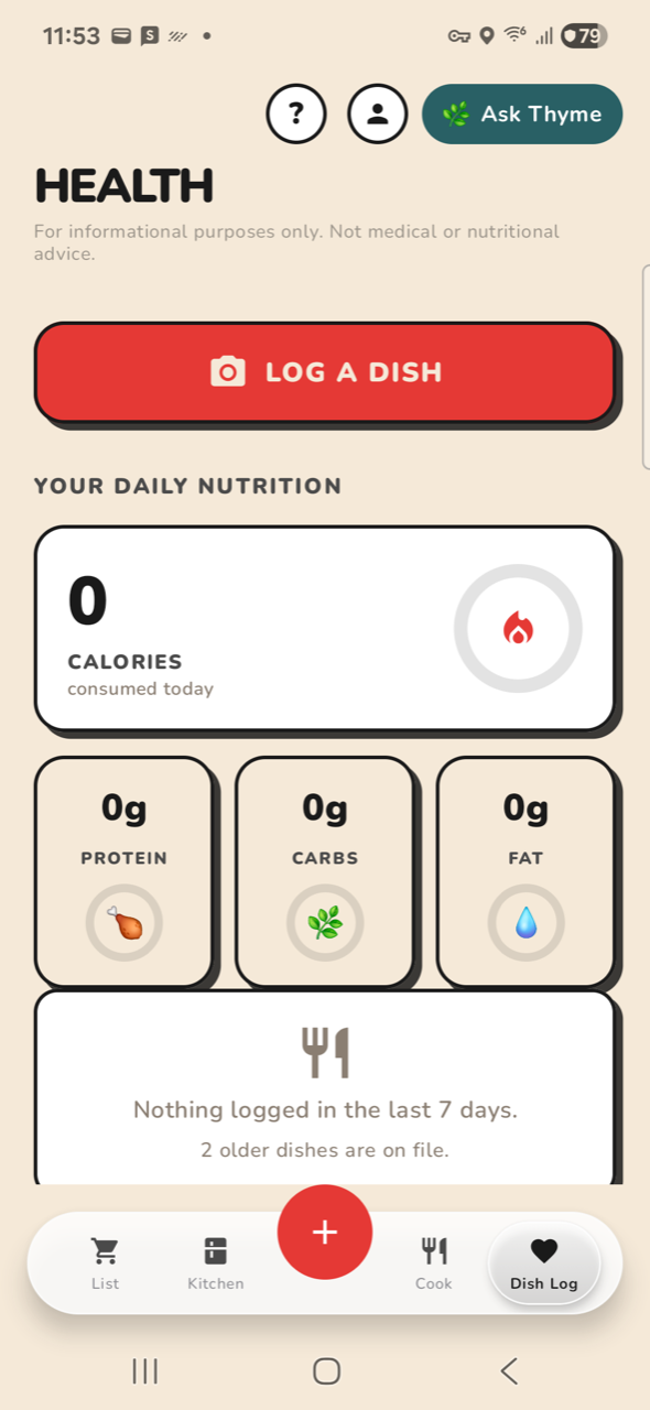
DISH LOG
BEFORE · title 44spAFTER · title 28sp · +33px
2 · Shopping rows carry the buyable name
Not photographable as a before/after — the fix changes rows written from now on, and the fat rows already on the list keep the names they were saved with. So it is pinned by test instead, against the exact Honey Garlic Shrimp lines that produced them:
Longest row goes from 60 characters to 13. The correctness half is pinned too: a list already holding “Soy Sauce” now suppresses the verbose duplicate, which it did not before. What it deliberately does not do is reduce “garlic cloves” to “garlic” — that needs a noun-head model, and getting it wrong puts someone in a shop holding the wrong thing.
Findings — ranked
CRITICAL
1The screen is mostly furniture, not content
On a 1280 px screen, the four main tabs give the user's actual data a window of roughly 350–400 px. Everything else is permanent chrome.
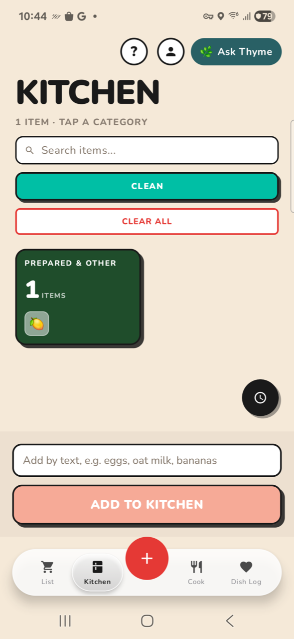
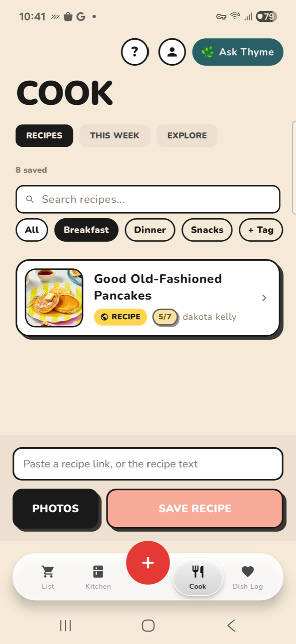
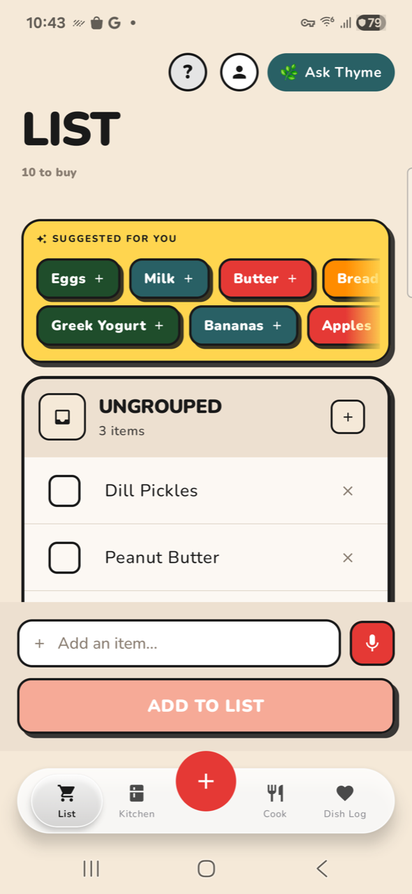
KITCHEN spends ~1000 px of chrome to show one category card. COOK has 8 saved recipes and shows one. LIST has 10 items and shows two and a half — the third row is sliced in half by the composer. The content window is ~30% of the display; the other 70% is header, title, search, filters, composer and nav.
Fix · Collapse the header on scroll, and drop the persistent composer to a single FAB action.
CRITICAL
2Three title scales — and the spec and the code disagree
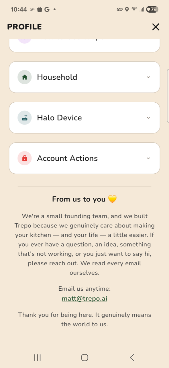
Tab titles render at a 48 px cap height. PAIR HALO is 32 px. PROFILE is 19 px. Same app, 2.5× spread.
“KITCHEN”, “LIST” and “COOK” are set in all-caps extra-bold at 48 px cap height and consume ~90 px including padding — to repeat a word the highlighted nav tab already says. This is the single cheapest ~90 px on every primary screen. That the app already ships a 19 px title on PROFILE shows the big one is not a system, it is just big.
kitchen-01-mainKITCHEN — 48px cap
16.1% deadchrome-03-profile-scrolledPROFILE — 19px cap
31.0% dead
Fix · Matt’s call, not a bug. 44sp is a deliberate iOS parity port (Theme.kt:TrepoScreenTitle, citing .font(.system(size: 44, weight: .black))) — but spec/DESIGN_SYSTEM.md:50 says “screen titles: ~28sp”. One of them is wrong. Shrinking to 28sp buys ~90 px on every primary screen and restores the spec, at the cost of deviating from iOS.
CRITICAL
3The list stores raw recipe ingredient lines as item names
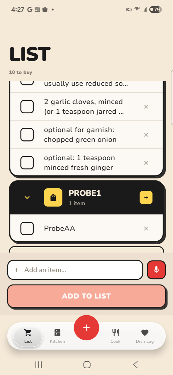
A row reads “2 garlic cloves, minced (or 1 teaspoon jarred minced garlic)”. It renders 135 px tall against 41 px for a normal item — 3.3× — and is still truncated.
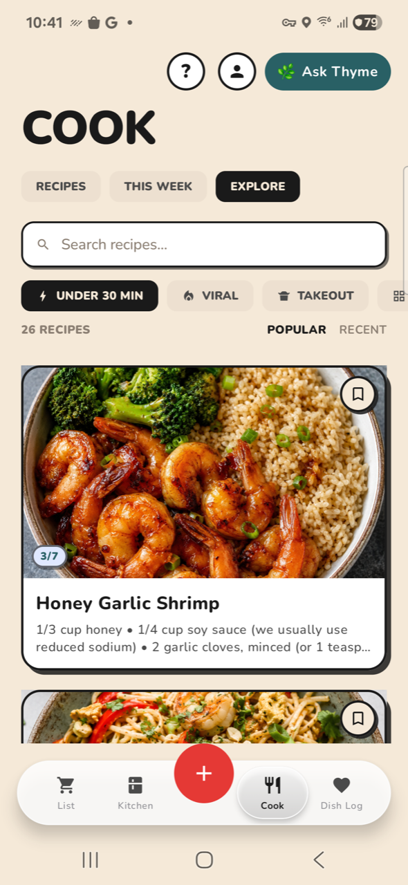
ADD MISSING TO LIST writes recipe.ingredients through to the row name verbatim (MealListPlanner.kt → PlannedItem(name)); nothing extracts the product from the measurement and prep note. Four consecutive rows on the live handset read “1/4 cup soy sauce (we usually use reduced so…”, “2 garlic cloves, minced (or 1 teaspoon jarred…”, “optional for garnish: chopped green onion”, “optional: 1 teaspoon minced fresh ginger”. You do not buy “optional: 1 teaspoon minced fresh ginger” — you buy ginger. Same root cause breaks correctness: the planner's own comment concedes the kitchen check “will not catch ‘2 cloves garlic’ against a kitchen row named ‘Garlic’”, so verbose names also defeat the de-duplication and put things on the list you already own. It is not confined to LIST. On COOK / EXPLORE the same array is joined with bullets and used as the recipe card’s subtitle — “1/3 cup honey • 1/4 cup soy sauce (we usually use reduced sodium) • 2 garlic cloves, minced (or 1 teasp…” — two lines of measurements where a subtitle should carry time, servings or a description. Same array, same verbatim reuse, second surface.
live-list-ingredientslive handset — 4 ingredient rows, 2 truncated
cook-03-exploresame strings as a recipe card subtitle
8.6% dead
Fix · Extract the product from the ingredient line before it becomes a row name; keep the full line as secondary text if it is worth showing at all. This is an iOS port, so it needs the same fix on both arms.
HIGH
10The app already contains its own fix, three times over
The density problem is not a missing capability. Trepo already ships a compact, well-proportioned answer for each of its worst screens — on a neighbouring screen.
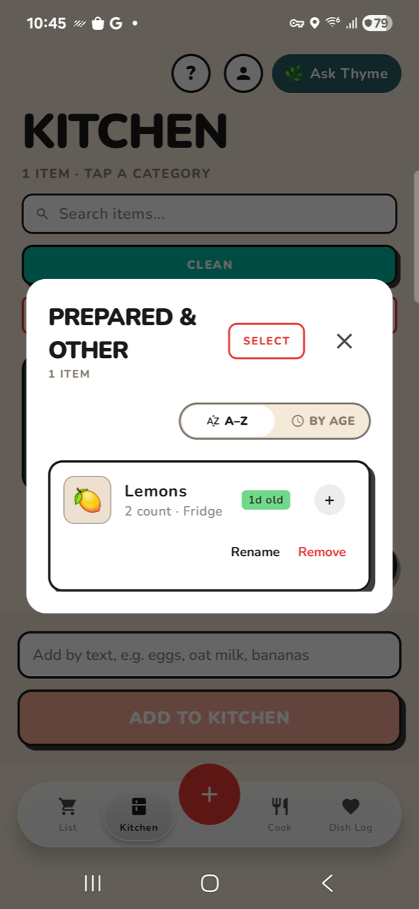
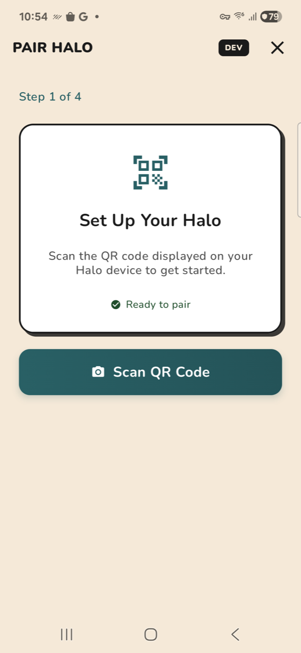
EXPLORE vs RECIPES, same tab: EXPLORE drops the composer, leads with the photo and runs 8.6% dead; RECIPES keeps the composer, shows one small card and runs 25.9% dead. The kitchen row vs the item sheet: the category modal says everything worth knowing about a lemon — emoji, name, “2 count · Fridge”, “1d old”, Rename, Remove — in about 90 px; the item detail screen spends a ~320 px emoji hero to say less. PAIR HALO vs the main tabs: a 32 px title, one card, one action, no composer — it is the best-composed surface in the app. So this is not a redesign. It is applying the app’s own better pattern to the four screens that do not use it.
cook-03-exploreEXPLORE — 8.6% dead, image-forward
8.6% deadcook-01-recipesRECIPES — 25.9% dead, one card
25.9% deadkitchen-04-categorythe compact kitchen row, ~90px
4.8% deadhalo-01-pairingPAIR HALO — one card, one action
45.1% dead
Fix · Port EXPLORE’s composition to RECIPES, and the category modal’s row to the item sheet. No new design language required.
HIGH
4Sixteen screens are more than 45% empty
Across all 56 captures, median dead space is 21% and mean is 26.8%. The worst are near two-thirds void.
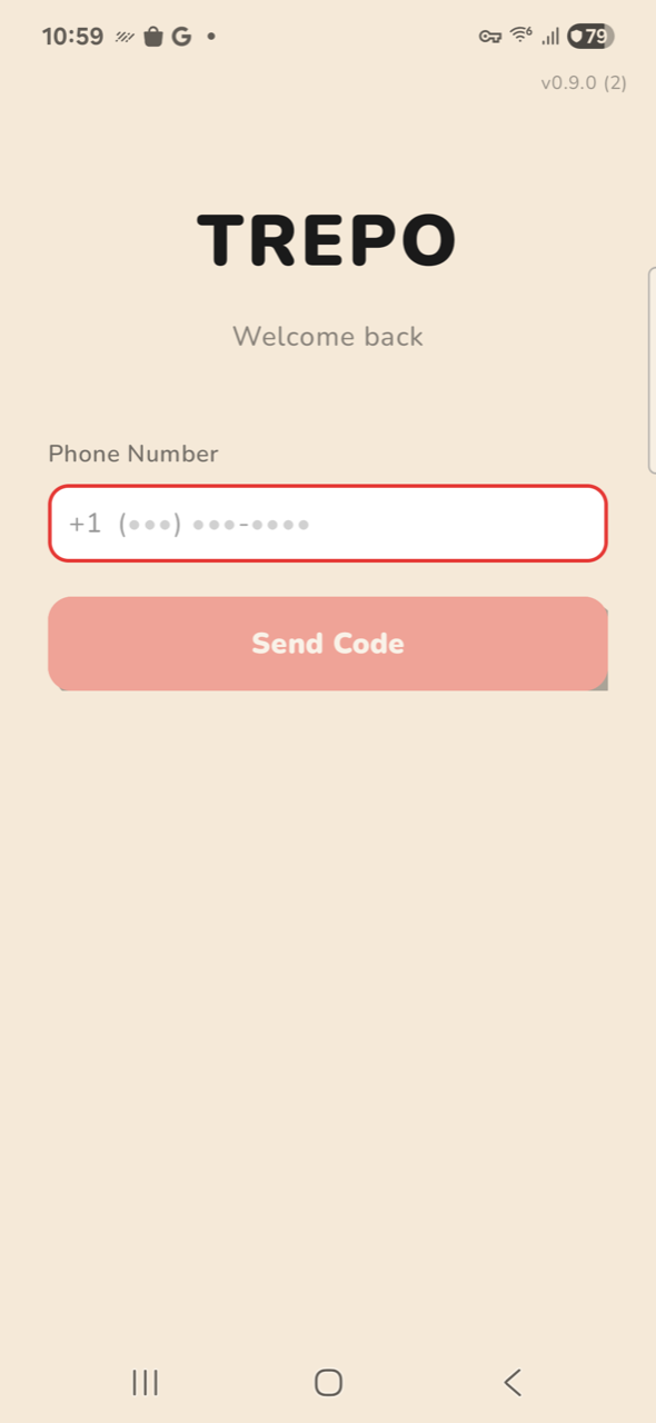
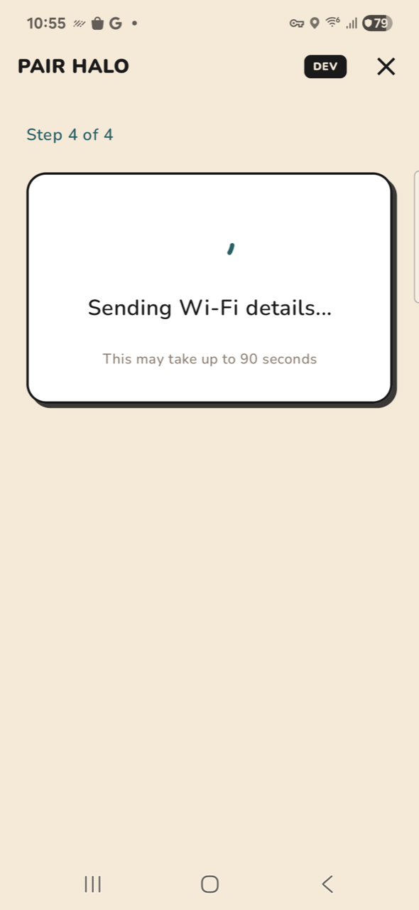
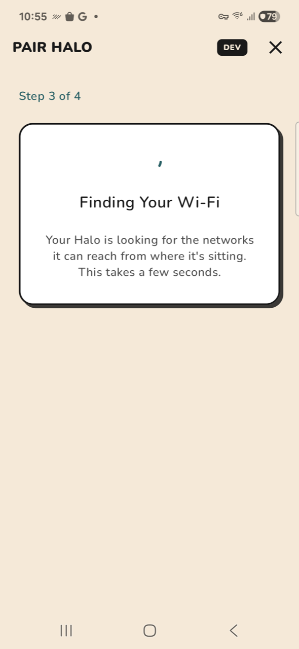
Sign-in, every Halo pairing step, and the camera-permission screens cluster their content in the top third and leave a 500–625 px void beneath. The content is not too big for the screen here — it is stranded at the top of it. Same root cause as the density complaint: a layout system that top-aligns everything and never centres or fills.
auth-01-signin62.4% dead — 578px void
62.4% deadhalo-09-prov-0063.7% dead — 625px void
63.7% deadhalo-03-scanning60.7% dead — 591px void
60.7% dead
Fix · Vertically centre single-purpose screens; the pairing card should sit at optical centre, not pinned under the header.
HIGH
5Three competing ways to add an item, all on screen at once
A text field, a full-width primary button, and a floating + — simultaneously, on every tab.
The composer stack is ~155 px, the nav is ~110 px, and the red + FAB overlaps both. That is ~265 px (21% of the display) permanently reserved for one job, presented three ways. On KITCHEN the same band also carries CLEAN and CLEAR ALL as equal-weight full-width buttons — a destructive action given the same visual authority as the primary one, parked above the fold.
kitchen-01-mainCLEAN + CLEAR ALL + composer + FAB
16.1% deadcook-01-recipesPHOTOS + SAVE RECIPE + composer + FAB
25.9% dead
Fix · Keep the FAB, drop the persistent composer to a sheet it opens. Demote CLEAR ALL to the overflow menu.
HIGH
6Detail sheets bury the thing you opened them for
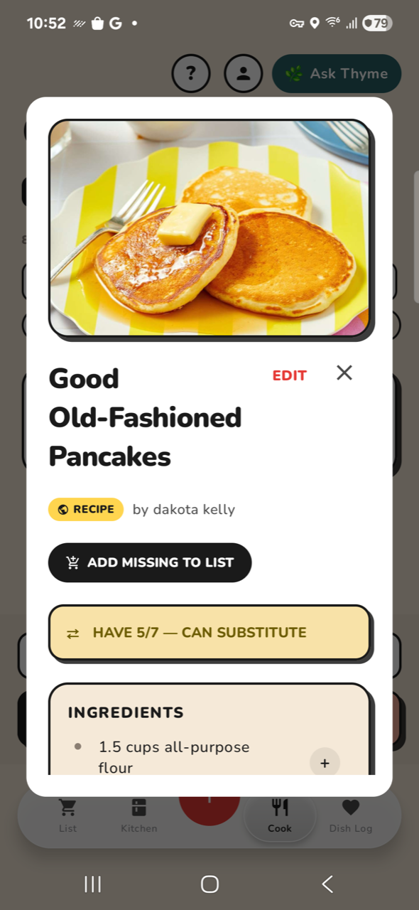
On the recipe sheet, INGREDIENTS starts 78% of the way down. You see 1.5 lines of the first one.
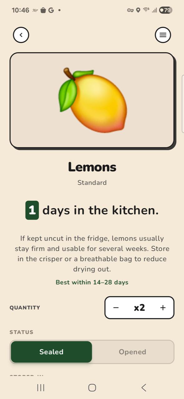
A 3-line title at display size, a RECIPE badge, a byline, ADD MISSING TO LIST and a HAVE 5/7 banner all land before any ingredient. The KITCHEN item sheet is the same shape: a ~320 px emoji hero, a name, a 4-line prose paragraph and a best-within line before QUANTITY at y 985 — the controls you came to use start ~77% down.
cook-06-recipe-detailingredients begin at 78% depth
0.0% deadkitchen-06-item-detail~320px emoji hero, controls at 77%
24.3% dead
Fix · Shrink the hero to a 96 px thumbnail, put title+meta on one row, and let content start in the top third.
MEDIUM
7Zero states get hero treatment
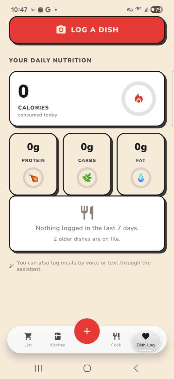
Dish Log spends ~420 px rendering four zeros.
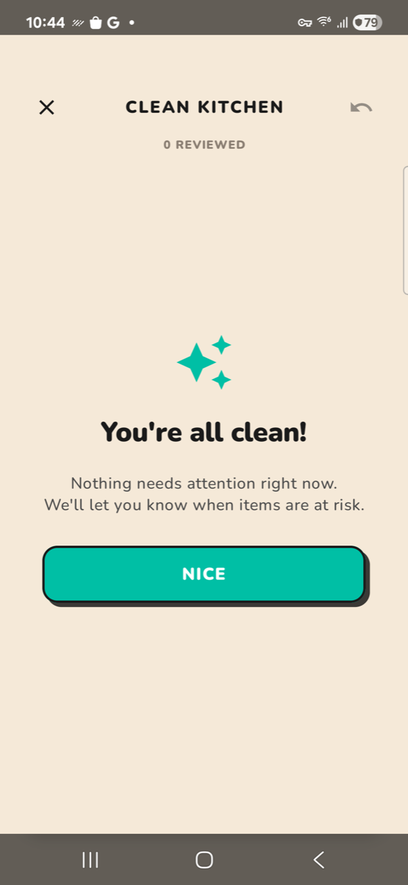
A calorie ring, three macro tiles and an empty-state card all render at full size to say “nothing logged”. “You’re all clean!” takes a whole modal (56% of it empty) for a message that is a snackbar. Empty states should shrink, not occupy the same footprint as populated ones.
dish-02-scrolled420px to display 0/0g/0g/0g
19.6% deadkitchen-03-cleanfull modal, 56% dead
56.2% dead
Fix · Collapse the macro row to a single line when all values are zero; make “all clean” a snackbar.
MEDIUM
8Heavy borders and hard shadows multiply the weight
Every card carries a ~3 px black border plus an offset hard shadow.
The treatment is consistent and it is part of the brand, but it is applied at the same weight to a 700 px hero card and a 40 px chip. At small sizes the border is a large fraction of the element, which is a real contributor to “everything looks too large” even where the box is not.
dish-02-scrolledborder weight constant across scales
19.6% deadlist-01-populated3px border on 40px chips
4.8% dead
Fix · Scale border weight with element size — 3 px on heroes, 1.5 px below ~64 px.
MEDIUM
9Small correctness bugs the audit surfaced
Three that are cheap to fix and read as sloppiness.
“1 days in the kitchen” — unpluralised. The sign-in phone field renders a red error border in its resting empty state, before the user has typed anything. The Profile founder letter is ~450 px of prose (39% of the screen) below the settings cards.
kitchen-06-item-detail“1 days in the kitchen”
24.3% deadauth-01-signinred error border, untouched field
62.4% deadchrome-03-profile-scrolled450px founder letter
31.0% dead
Fix · Pluralise; make the field border neutral until validation fails; move the letter behind an About row.